
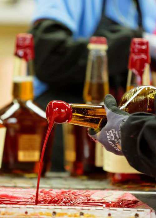
When you pick up a bottle of Maker’s Mark bourbon, the first thing you notice is probably the red wax that drips down the neck of the bottle. It’s a result of hand-dipping each bottle upside down into a pot of hot crimson goo.
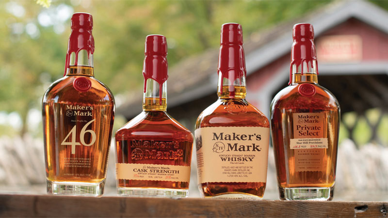
While this is a nice custom touch, it’s not technically the “mark” of Maker’s Mark. The true calling card of the iconic whiskey is a very small symbol on the label, one that’s often ignored, but actually carries a lot of significance.
To the naked, uninformed eye, the mark is the letters S, I, and V inside a circle overlaid by a star on the lower left. It was designed by Margie Samuels in 1953, when the Kentucky straight bourbon whiskey was first crafted by her husband, Bill Samuels Sr.
Margie was the mastermind behind Maker’s Mark’s branding, from the red wax to the name of the bourbon itself. Its name is inspired by the generic “maker” — that is, an artisan who hand-crafts spirits in which taste and texture take precedence over the inebriation factor, like so many harsh whiskeys before their time.
“American whiskeys, many of them were aggressive and sort of a test of manhood,” Bill Samuels Jr., the son of Margie and Bill Sr., says. “Could he lift bourbon and organically create a full straight bourbon that had soft, rich, full-flavored balance? A full- strength bourbon you hold on your tongue without the bitterness.”
Samuels Sr. did create an artisanal bourbon whiskey that he liked, and he could have easily given it his family name, especially since the Samuels family had been distilling for generations. Margie, however, had other ideas. “She suggested that if you were to name his new handmade, refined bourbon after ‘Samuels,’ that customers could be confused with that horrible, wretched God-awful whiskey ‘TW Samuels’ which has been in our family for more than a century,” Samuels Jr. says.
And so, as a celebration of spirits being handmade by makers, the bourbon became merely “Maker’s Mark.” The S in the logo is a subtle nod to the Samuels family legacy. Samuels Sr. is a fourth-generation distiller, so the Roman numerals “IV” represent his lineage.
And the star symbol? The original Maker’s Mark bourbon whiskey, along with all its expressions, is made where it all began, at the Star Hill Farm in Loretto, Ky.
Even if you’ve made it this far, there’s one more characteristic on the Maker’s Mark logo that’s so subtle, you could miss it. If you look very closely, you’ll see that the circle has tiny notches in it on the lower right side. While this may seem like a simulation of an inked stamp, the breaks in the circle are intentional. Margie Samuels added them to represent the dark times in American distilling, or periods when the sale of alcohol was illegal, such as the Civil War, World War I, and Prohibition.
Bill Samuels Sr. may have been the “maker” of Maker’s Mark bourbon, but Margie Samuels was the brains behind the brand. Her efforts, even if subtle, haven’t gone unnoticed; in 2014, she was the first woman to be inducted into the Kentucky Bourbon Hall of Fame.