We know it’s silly to judge a book by its cover, especially when it comes to wine. Still, when we look over these beautiful wine label concepts we can’t help but reach for our wallets. Some of these are design projects and others are limited edition/one-off labels for actual wineries or corporate clients. Whatever the case, you’re not going to find them on the shelves of your local wine shop.
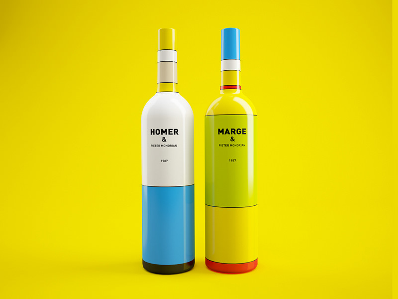
The Simpsons Wine Packaging
Designers: Constantin Bolimond & Dmitry Patsukevich – We’ll kick things off with this incredible Simpsons/Mondrian mashup as it was the inspiration for putting this post together in the first place. When it crossed our email boxes this morning we immediately fell in love. Can someone please make this wine happen in time for the 552 episode marathon on FXX starting August 21st?
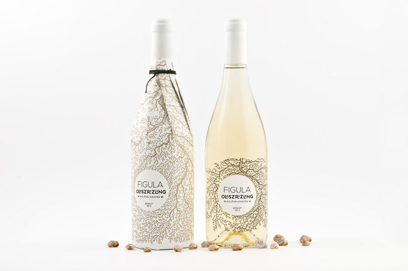
Figula – Putting The Roots On The Bottle
Designers: Peltán-Brosz Roland & Rohmann Nóra – From the surreal above, to the sublime below. This concept was entered in the Cégér a jó bornak design contest where it was selected among the ten best. We’d have to agree.
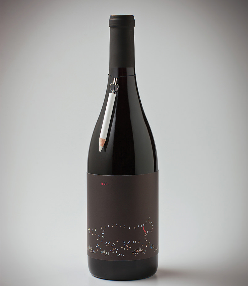
“Point After Point” aka Connect The Dots
Designer: Brandon Oltman – So this incredible bottle – with a pencil to connect the dots – was created for Cargill to highlight a product for pet food manufacturers who were attending the Pet Food Forum trade-show. We might just have to branch out into the pet food business…
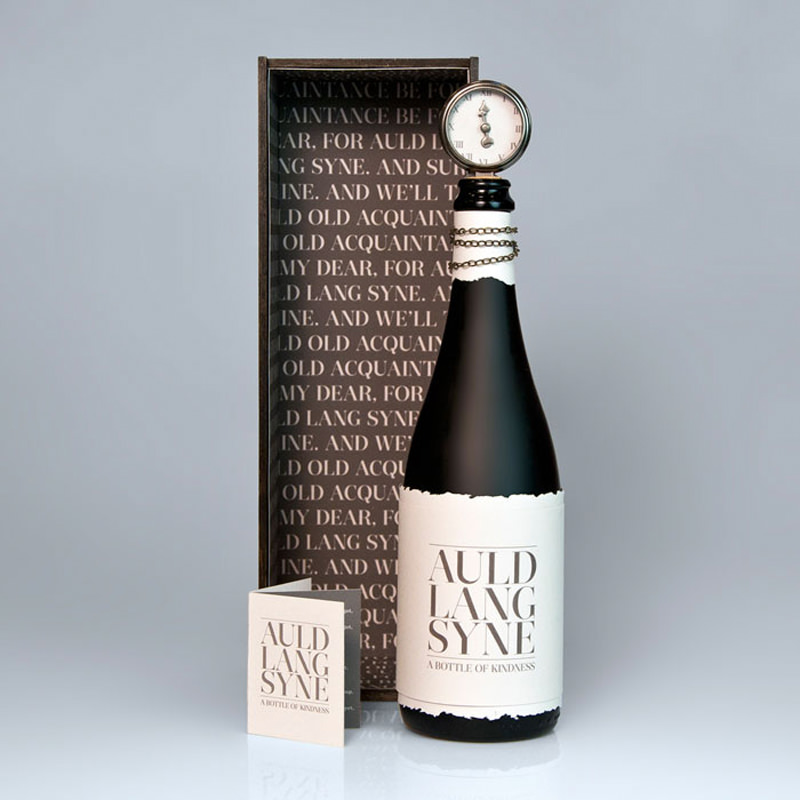
Auld Lang Syne (Times Gone By)
Designers: Audrie Kapinus & Kristin Breslin Sommese – How would you like to receive this New Year’s Eve themed bottle as a gift? We would…
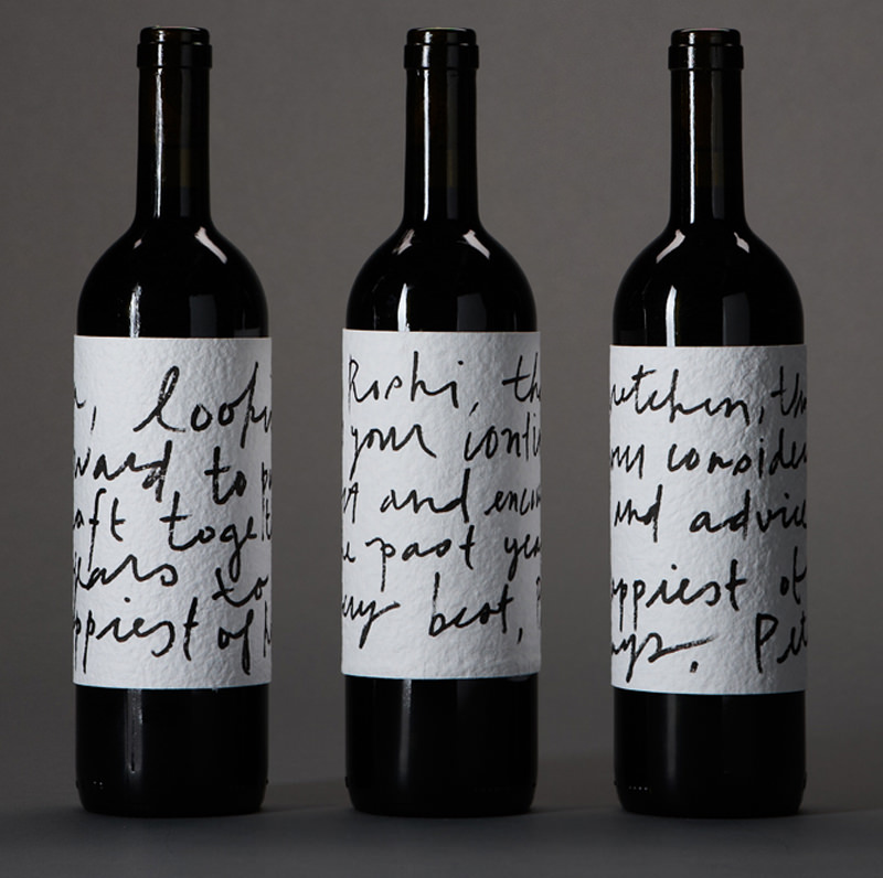
Holiday Cards
Designer: Peter Antonelli – While we’re on the subject of gifts, we found this great idea for a bottle where the label doubles as a gift card.
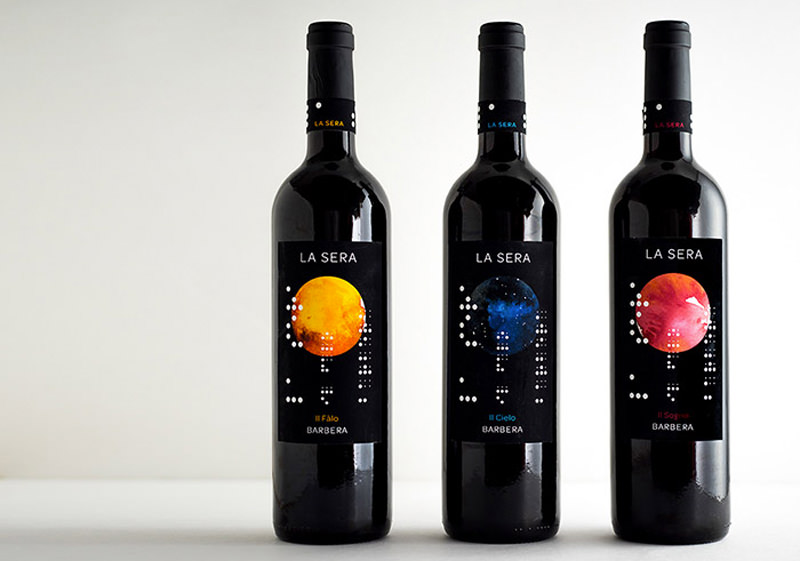
La Sera Wine
Designer: Sonia Persad – These bottles are more than just beautiful. Quoting the designer: “La Sera” means the evening in Italian. Since the night touches us all, and wine is something that should be shared and enjoyed by all, circles are used throughout the design…The organized white dots are actually the label translated into Braille, again recalling both the idea of togetherness and the circular motif.
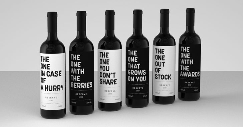
The One Series for Easy Choice Winery
Designer: Realist Branding – This series of labels got quite a bit of well-deserved attention back in the winter with funny, to-the-point names like The One You Don’t Share. As we can’t seem to find these for sale online, if anyone is headed over to the Easy Choice Winery, please, grab us a bottle…or six.
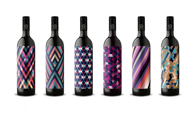
The Geometric Art Of Motif Wine
Designers: EN GARDE – We’re suckers for geometric art – notice the hexagons around here? – so these labels really appealed to us. These are bottles you can buy, direct from the winery if you live in Austria, Germany or Switzerland. We’re in NYC for the foreseeable future, so we’ll have to wait on these.
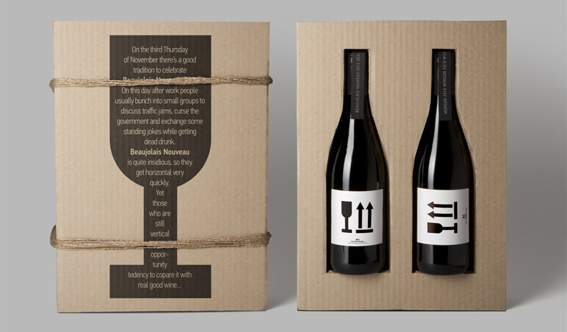
Now & Later // Beaujolais & Morgon
Designer: Masha Ponomareva – Here’s the design for another great corporate gift. What’s one to do with a bottle of Beaujolais Nouveau and a bottle of a Morgon from Beaujolais? Drink that Beaujolais now and save the Morgon for later. (If you said drink the Morgon and re-gift the Beaujolais Nouveau we wouldn’t judge you…and neither would this gift’s lovely box.)
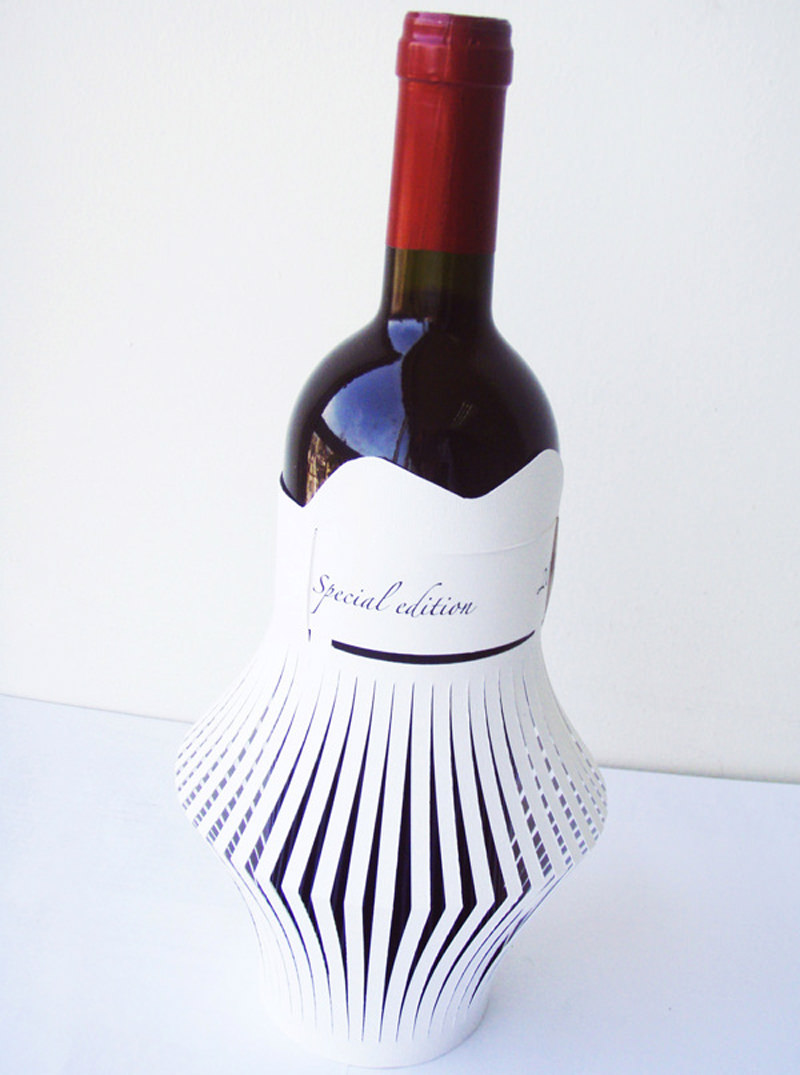
Paper Cut Lantern
Designer: Carine Teyrouz – This inventive design reminds us of folding paper lanterns, which is exactly what the designer suggests you can do with the label if you slip it off the bottle. Sometimes one plus one is definitely more than two.
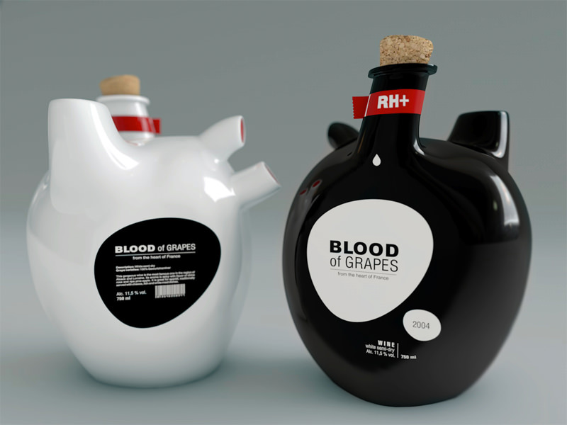
Blood Of Grapes
Designer: Constantin Bolimond – Sick of the usual heart shaped Valentine’s Day gifts? Why not go with wine…in an (actual) heart shaped bottle.
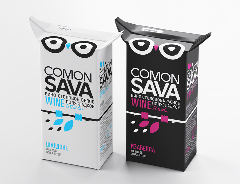
Box Wine You Can’t Miss – Comon Sava
Designers: STUDIOIN – What wine wants to get stuck on the lowest shelf in the box wine section of the store? This guy. Try and walk by without noticing the a pair of eyes (and ears) looking up at you.
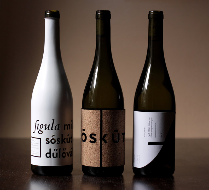
Bottles You Can Feel – Sóskút Wine
Designers: Ágnes Rubik & Ákos Polgárdi – The designers created these labels, which use interesting materials and leveled effects, for the Cégér 2014 wine label design contest.
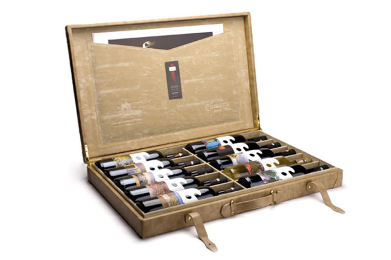
Paint Tubes…Of Wine – Málaga Conarte
Designers: El Cuartel – To highlight the wines of Malaga, Spain, a local organization commissioned ten local artists to design labels for ten great bodegas, which they packaged up in this neat case.
A Wine Label That Changes As You Spin It
Designers: Adronauts – Our last wine, a Riesling infused with elderberry and energizing Yerba Mate tea, is definitely available for purchase with a straightforward (though still beautiful) label. The bottle we want to buy? It’s animated!
