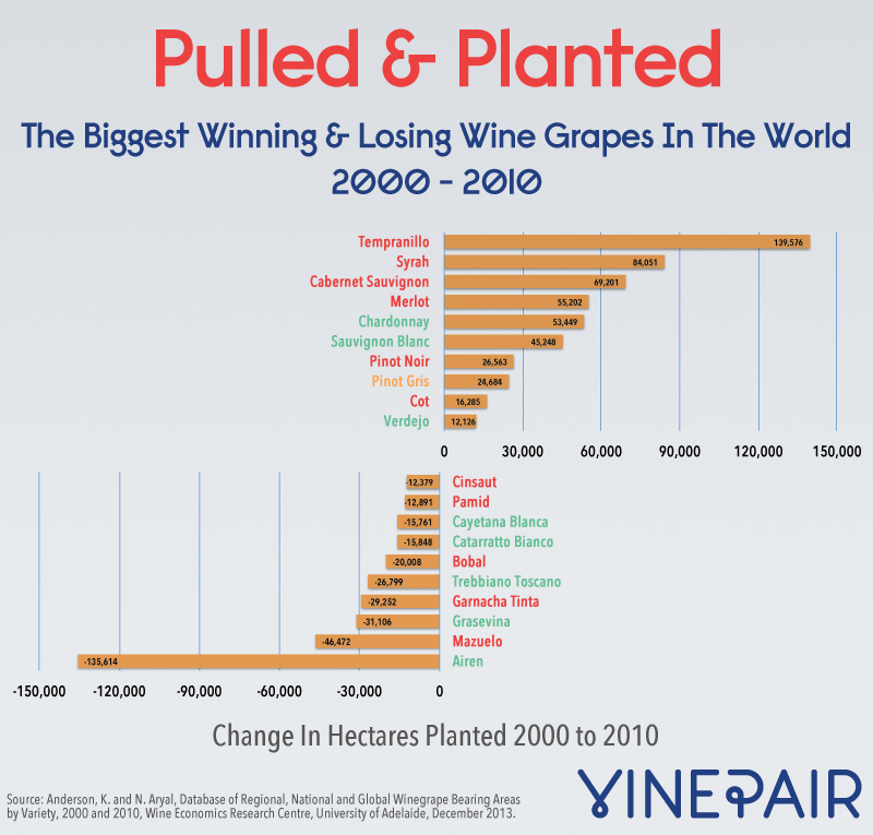
The Wine Economics Research Centre at the University of Adelaide in Australia recently published a ton of data on the state of the wine industry around the world. They put a special focus on how things have changed from 2000 to 2010. We decided to chart our favorite set: the grapes that have been planted the most and those that have been pulled up the most.

Head over to The Wine Economics Research Centre site to see all the data, along with some interesting analysis.
