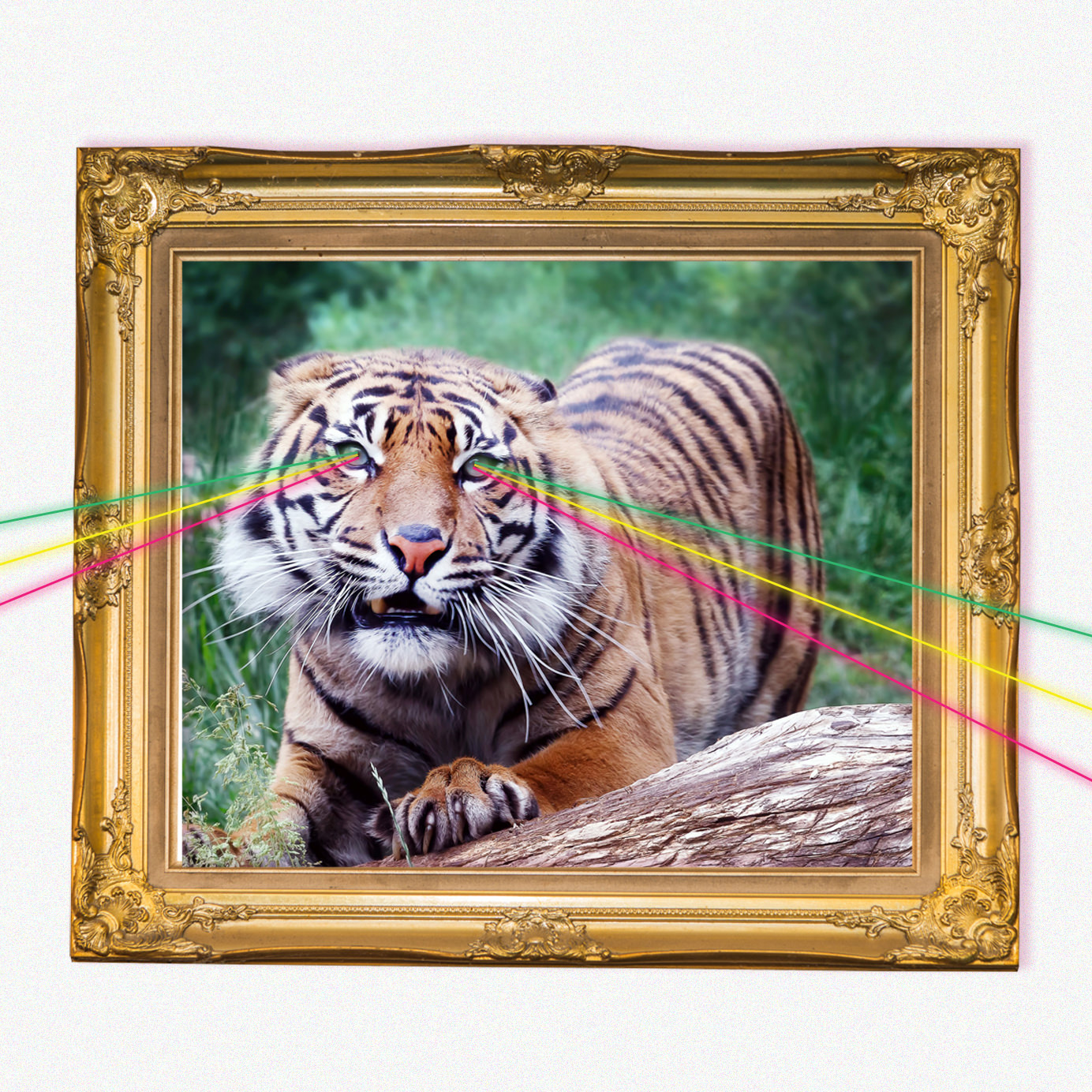
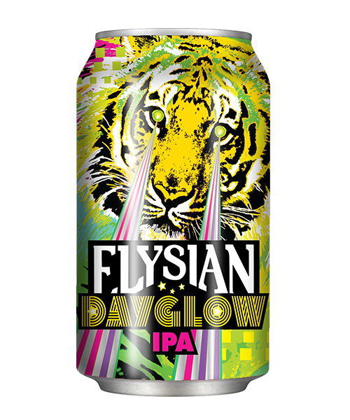
Elysian Brewing Company’s Dayglow can is iconic. Eye-stopping hydraulic greens and yellows, lasers, and a tiger — you know which beer it is right when you see it. Recently, Elysian put Dayglow into cans and brought the label with it. So we figured now is as good a time as ever to look back on the original label.
The can release is the first time in 21 years that Elysian has chosen aluminum instead of glass bottles. Dayglow first came out in 2015 in 22 ounce bottles as part of the Seattle brewery’s Manic IPA series. Its big, full hop flavor was a hit among hoppy beer lovers, and it quickly became a fan favorite. Within a year, it was available year-round in 12 ounce bottles before becoming Elysian’s inaugural canned beer.
We caught up with Elysian co-founder Joe Bisacca to learn how the label was created. We weren’t sure what to expect, but we sure didn’t expect quarters, tequila shots, and Pop Rocks being a part of the equation.
What was your Inspiration for the Dayglow label?
“If we’re talking about Dayglow then I’ve got to go back to Space Dust,” Bisacca says.
When Elysian was a small brewery doing experimental beers for pubs, they’d put the images on a magnet board and stick them up on a wall — one magnet for each beer. And when “you’re doing 110 beers a year, graphically you’re challenged because you’ve got to come up with something new every time,” Bisacca says.
When they started working on the label for Space Dust, the in-house designer at the time, Corinne McNielly, grabbed an image from online and called it done. She was overwhelmed, overworked, and, as Bisacca says, “When you put things up at the bar, no one cares if you’re plagiarizing what you do.”
The Space Dust image was the original image from Pop Rocks candy from the 1970s.
“We totally stole it,” Bisacca says. “So we’re at the Craft Brewing Conference in Washington, D.C. and I wanted to put Space Dust in bottle and kick it out on the shelf, and obviously it was like, ‘Shit we can’t use that image, we’re going to get sued.’”
So they’re at the conference, had been drinking all night, and were trying to think of what to do while playing quarters with beer (and, when they ran out of beer, with tequila). “We were trying to think of other imagery for Space Dust and we Googled it,” Bisacca says, “and found this painting that somebody had done that was like, a sexy green alien lady shooting lasers out of her eyes and killing this astronaut and turning him into a skeleton.”
He called McNielly with his solution to the Space Dust problem. “I woke her up and I said, ‘Lasers. I got to have lasers coming out of her eyes,’” Bisacca says.
In the end though, Bisacca spoke with General Foods about the trademark and they said they weren’t going to use it again — Elysian could riff off of the Rock Candy logo.
Fast-forward about eight months, and the Elysian team was working on the design for its newest beer, Dayglow.
The team was looking through Google searches for “dayglow” to get ideas, and on the third page there was a picture of a tiger and it simply said “dayglow tiger.”
“I got a little fixated on the tiger,” Bisacca admits.
McNielly came back the next week with two options. One with the tiger, and one with the tiger with lasers coming out of its eyes as a joke on the late-night call Bisacca made to McNielly months back.
Bisacca was sold.
How does the design represent the beer?
After Bisacca and the Elysian team chose their label with the tiger and the lasers, they had one more problem. Or, as Bisacca says, “The whole thing came to what the hell does the label have to do with the beer?”
So Bisacca got to thinking. The colors look like the beer tastes — green and hoppy. The yellow tones bring back fresh melon and citrus flavors, and if you asked Bisacca to describe Dayglow in one word, it’d be juicy.
“When I close my eyes, it’s like honeydew and cantaloupe that are really coming forward and it goes with those color tones in a very Dayglow color way,” Bisacca says.
Sure, the tiger and the lasers have nothing to do with it, but what’s wrong with that? They’re cool. Plus, Bisacca says, “it all goes back to that drawing.”
Who designs your labels?
When Elysian was a small brewery, people on the team wore many hats. They didn’t want to use outside design firms because outside firms made designs that look like the firm’s designs, not like the brewery.
McNielly handled the books, the design, and more. The only sure thing was that the Elysian logo would be the same on every label in a similar location.
“Each of the beers, when you think of them, they have a very different personality for the liquid and we should celebrate that even further,” Bisacca says. “The bottles do their own things, too, so that’s where part of the fun comes in.”
The business grew and McNielly moved, but she still gives input on designs that the current team of designers work up for new beers.
Do you feel the overall design was a success with what you were intending for it?
Dayglow, Bisacca says, is one of the labels he’s really happy with. The recent edition of cans — Elysian’s first foray into aluminum rather than glass bottles — has only solidified his feelings about the design.
“I think graphically, you’ve got a lot you can do with the can,” Bisacca says. “With the bottle you can get constrained on what you can put on that label since it’s a three-fourths wrap. With the can, I can include the whole color, design and embed all of the verbiage you need on it.”
The only downside? It all comes back to the lasers.
“One thing I miss with the bottle is I got to do a foil treatment with the lasers, so the lasers turned out really well,” Bisacca says. “With the can, what we did was we did the lasers as a clear coat over the aluminum, which shows metallic. It’s not as glisteny as with the foil — you just can’t do the same treatment.”

